When images of extraterrestrial skeletal remains surfaced online, I already had a travel app designed for them.
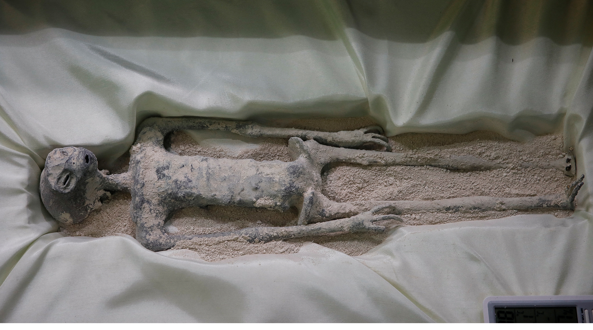
Extraterrestrial skeletal remains found on earth (supposedly)
The more I studied the anatomy, the clearer it became that my design wouldn't work for them.
Three long narrow fingers. A deep skull. Eye sockets that suggested no peripheral vision. Each constraint I pulled on led to another. If they couldn't hold a phone, what was the device? If they had no peripheral vision, what was the interface? If touch didn't work, what did interaction even mean for them?
To answer those questions, I needed to understand where exactly I had gone wrong in V1.
F42 Version 1
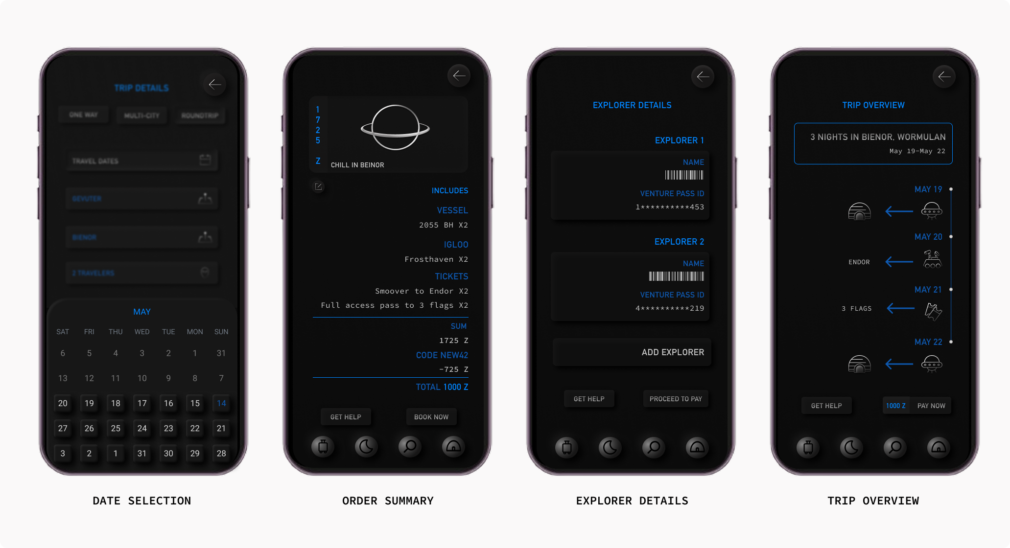
I had previously designed a travel app for the extraterrestrial beings of OX3 to help them find the meaning of life by exploring the universe. The visual design was focussed on what each element on the screen would look like if the user (the alien) was looking at it with a blue filter.
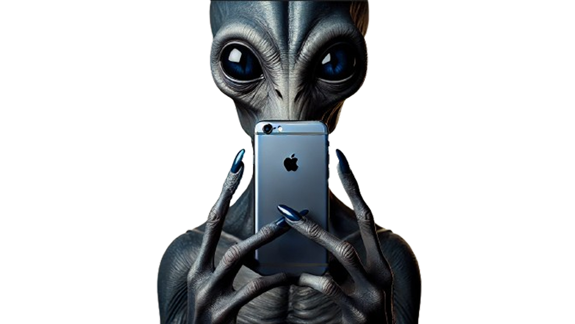
They could not possibly be using an iPhone. It just wouldn’t fit in their hands.
They seem to have a deep skull which when filled with matter would be quite heavy. So, holding any device with their hands would be uncomfortable.
Their eye sockets are visibly deeper which makes me question if they have peripheral vision.
Interactions
The human keypad wouldn’t work based on the anatomy of their hands.
All interactions in V1 relied heavily on touch. I had added depth to the buttons to make them look tactile but looking at the fingers in these images, they must be having a tough time interacting with technology if they are pressing buttons while holding a phone.
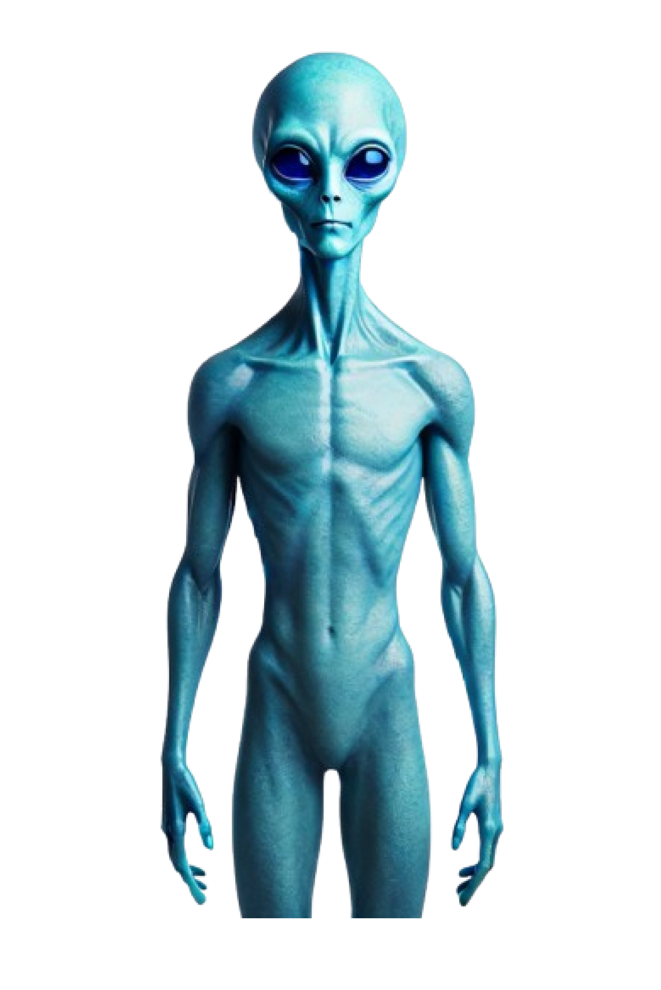
AI generated image of an OX3 alien holding an iPhone.
Emotion
The copy was designed to elicit an emotional response. Bold of me to assume that it would work on a non-human.
Snippets from V1 that were designed to elicit an emotional response
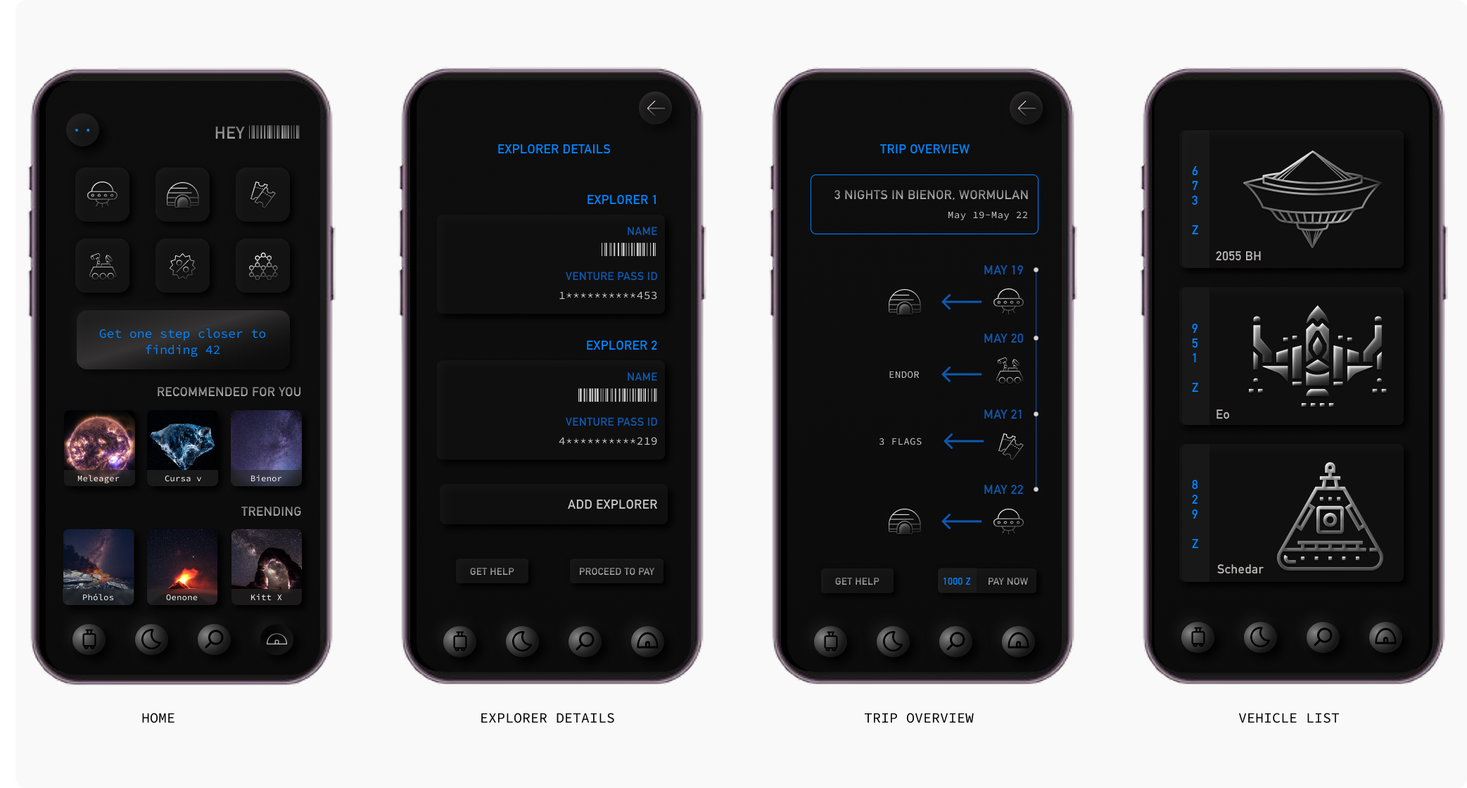
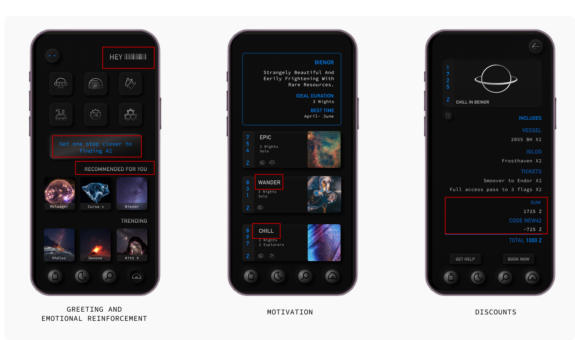
Booking Process
The process of booking a trip was very human. It followed logic as we know it which included selecting one option that works out of multiple options and choose a package that matches the vibe of the trip.
Friction
The number of clicks involved in completing an action was as human as it could get because of the friction that was introduced deliberately.
Commerce
There were multiple options for vehicles, stays and activities.
Payment was a part of the trip confirmation process.
The booking user flow in V1
V1 had been designed for a user I imagined. V2 would be designed for a user I could study.
The User
Meet Xylo 👋
They live on a plant called OX3 and absorb energy from their moon- which is red, to survive which is what makes their skin and eyes blue.
They have 3 long and narrow fingers, a deep skull and no emotions (not the kind we’re used to anyway).
Everyone on OX3 has equal ability so accessibility as we know it, does not exist.
Capitalism is not a thing on OX3. There is one option that works perfectly and everybody uses the same thing.
And, no one on OX3 has any human tendencies.
AI generated image of Xylo
My Approach
Device
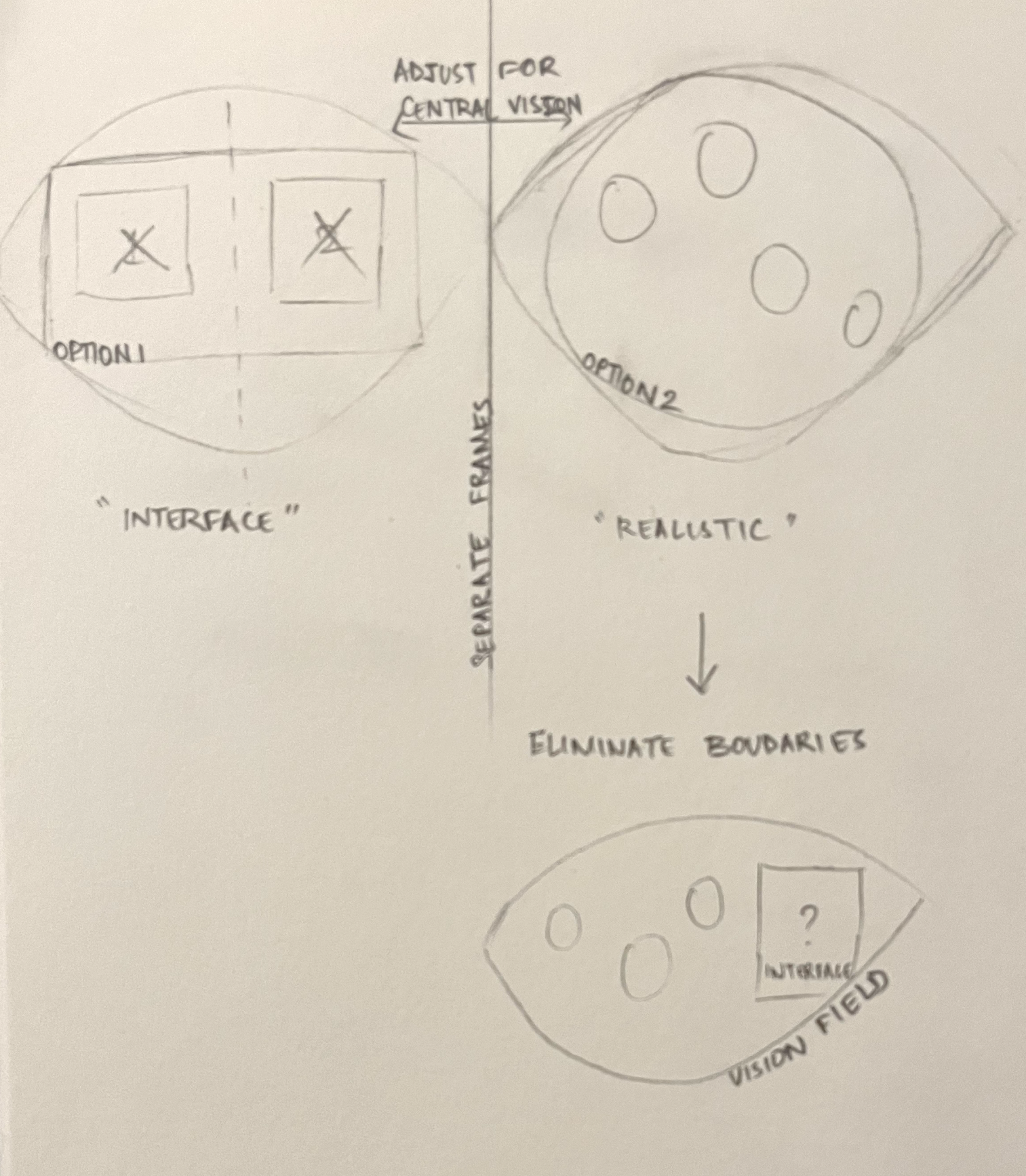
I started by mapping the position of their eyes to see if any of the earthly devices would work for them but wearing a rather heavy 3D camera that would anyway restrict their field of view didn’t make a lot of sense.
I decided to start from scratch and think outside the boundaries of a device. It couldn’t be handheld and the elements on the screen had to be visible to a user who only has central vision and everything they look at looks blue.
Removing all boundaries from the interface would be the most comfortable option and the more I thought about it, there really did not have to be a device.
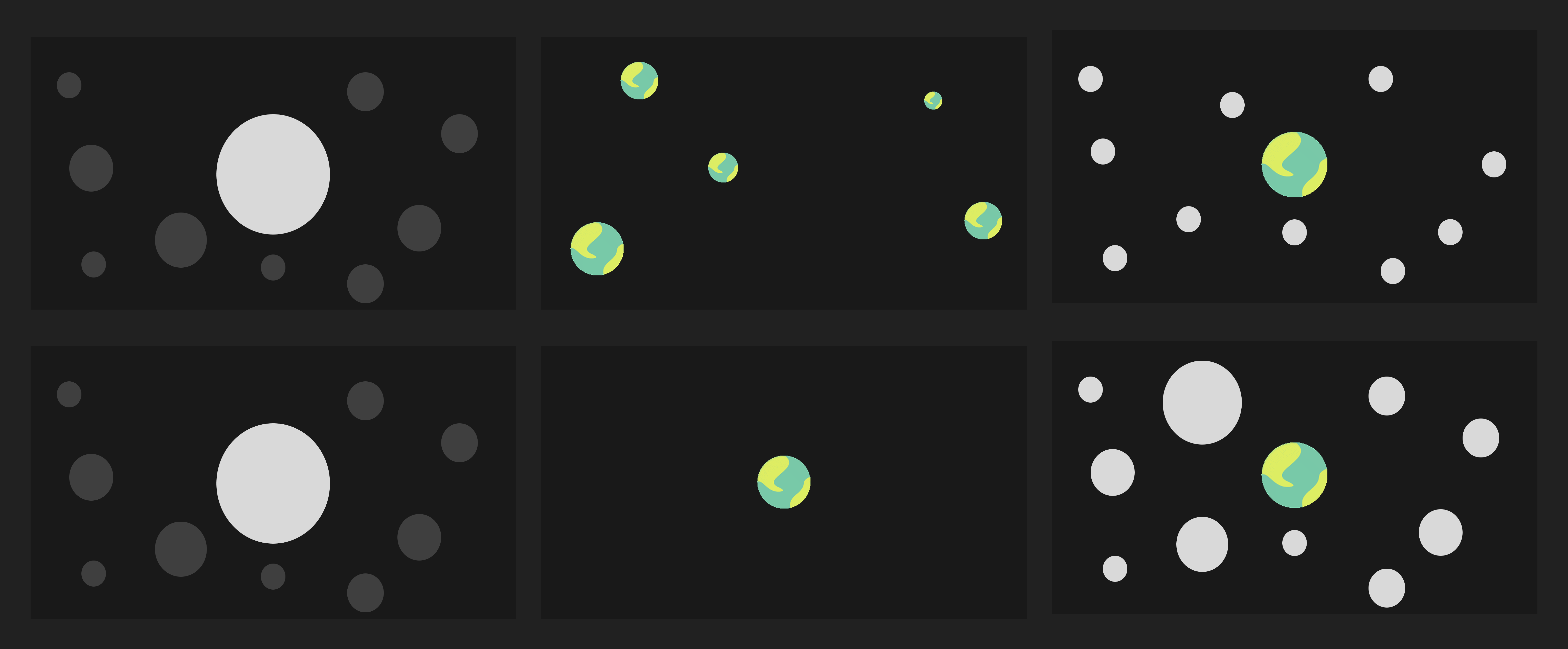
Initial sketch to evaluate different interface options
Activating the Interface
Having established that no one on OX3 experiences emotions, it follows that their sense of ethics would be fundamentally different. That means their inhibitions would be different too.
So, they have a gadget installed within them that would activate this application when they need it and all interactions are based on their thoughts and vibration(sound).
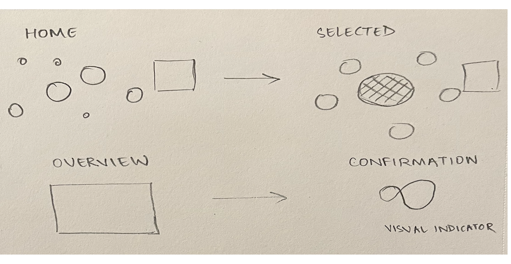
User Flow
As I was removing all forms of capitalism from the design, I removed everything that caused friction because it wasn’t necessary anymore and this reduced the number of clicks by 90%.
Initial sketch of the user flow
Experimenting with different selection patterns
Spatial Design
Here’s a video demonstration of my proposal-
Visual Design
3D
My main focus for V2 was to understand spatial arrangement and how light would interfere with objects in space so it made perfect sense to go 3D.
I chose Spline because I could easily show the light, plane and different perspectives during critique.
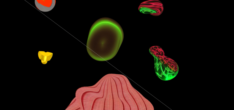
Objects
The goal was to make the objects look unfamiliar to the human eye by reimagining what the universe might look like without any visual reference.
I started out with basic shapes and kept modifying the extrusion until it looked unusual to the human eye.
I also wanted to make sure that I wasn’t being consistent with my treatment because consistency is human too.
Materials
The main objective with the materials used on these objects was to ensure they were impactful with the blue filter.
Applied color, depth, noise, matcap, and fresnel in different ways across each object to create a sense of visual distortion..
I experimented with layering materials differently on each object to not make them consistent.
Tried using the Spline AI texture generator, but it wasn’t quite the direction I had in mind, so I stuck with custom materials.
Exploring Spline's AI Texture Generator
Lighting
The background is black and ambient light is turned off in all the scenes because, space.
I’ve added one white light source in the top left corner for the light that’s being emitted by the celestial bodies.
Light 2 is red which is the moon and it faces OX3.
Both light sources are being emitted radially so there's a third light in the top right corner to have accurate wavelength.
The colors for light 2 and 3 are modified based on the wavelength that they fall on.
All objects have phong shading to ensure the reflections of the colors from the light sources are accurate.
Motion
Given I’m designing for this to be spatially accurate, I’ve modified the movement of each object’s base state displacement linearly to ensure they are still in view but are moving. I’ve deliberately avoided consistency here as well.
I’ve also used multiple states for each object to show interaction through animation.
Sound
I had established that those who live on OX3 derive meaning from what they’re seeing through vibration so I’ve included sounds for each object to convey what they’ve selected.
There is no use of text because sound is doing that for them.
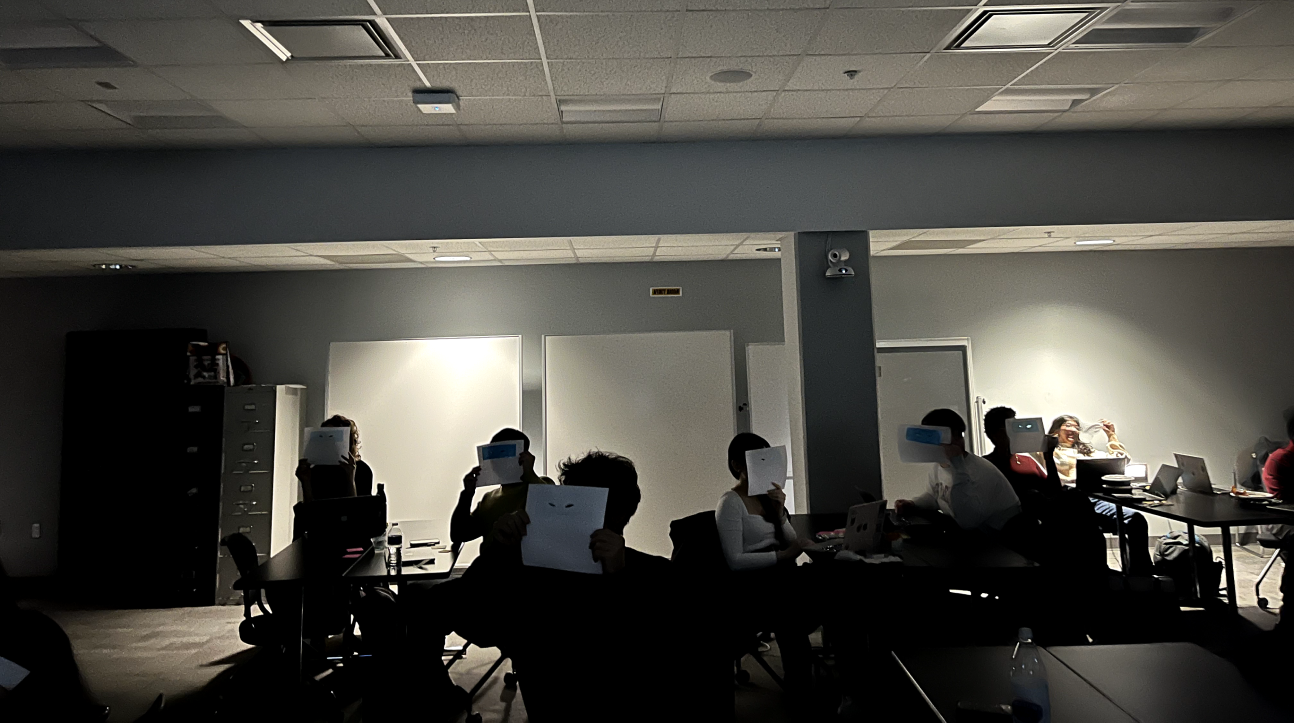
Critique
I wanted to make sure people got to see what Xylo would be seeing. So, everyone in the room viewed the prototype with an alien eyes cutout which was layered with blue cellophane sheet which I used while designing the user flow.
Design Critique Day
I designed an ad for OX3 inhabitants to promote the app. The sound conveys the message to those who live on OX3. The visuals and text help the rest of us understand it.
Prototype
Interactive prototype of the booking user flow on Spline
Reflection
The constraints were so far outside anything familiar that there was no existing reference to work from. Every decision had to be justified from first principles. One constraint led to the next and the bigger picture arrived at the end.
When new evidence appeared mid-process, it made the design better. That's the part I'd repeat on every project.
Credits
Professor Jason Aston for being invested in this project and taking me seriously when I pitched this.
.gif)