VISUAL DESIGN PROCESS
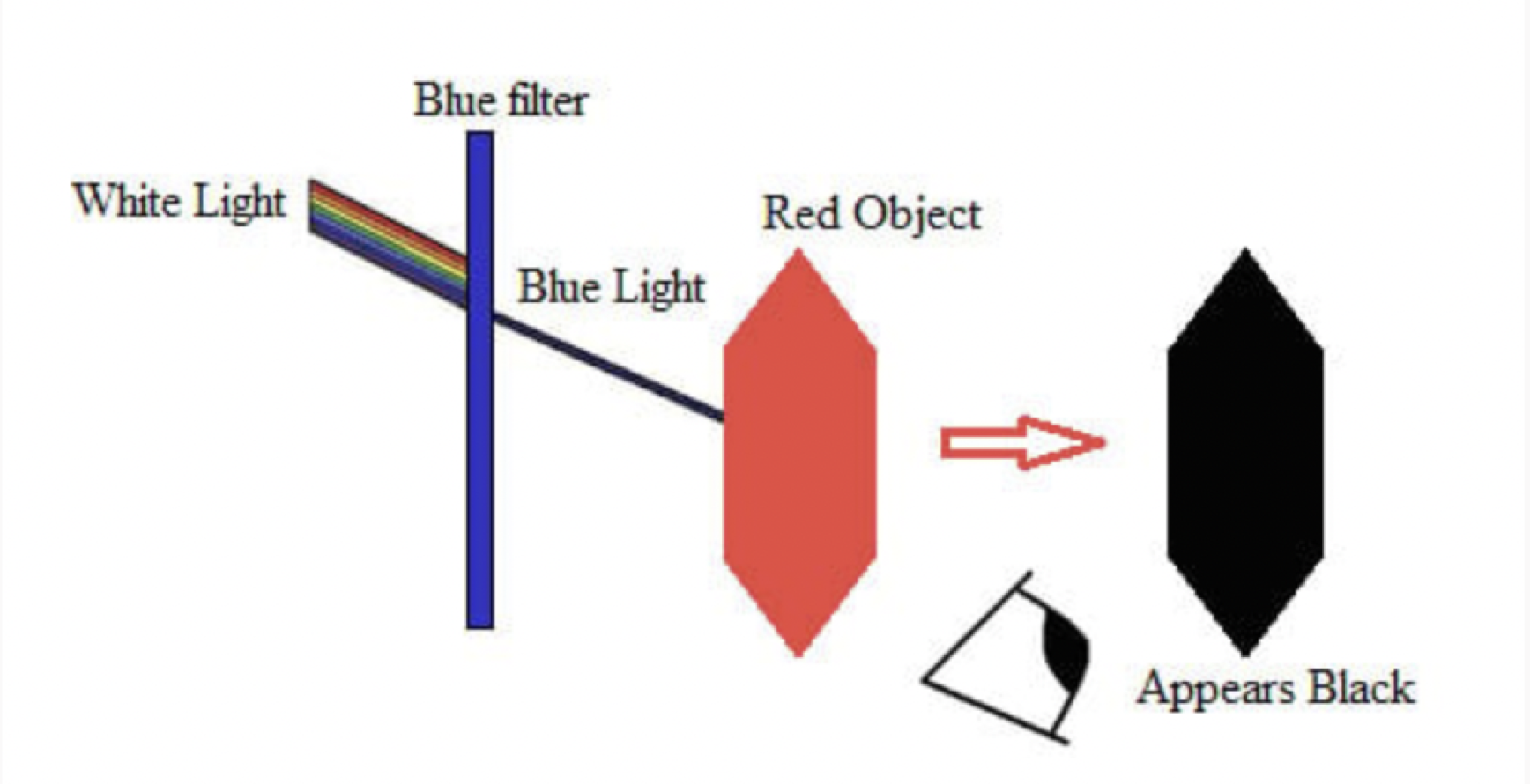
Initially, I aimed to use colors that would transform dramatically under a blue filter, like substituting red for black, and avoided using black and white to give the screens a unique, science-experiment feel. However, this approach didn’t pan out as expected. I experimented by using a cellophane sheet and applying a digital filter in Figma, but excessive natural light interfered with the results. So, I shifted my strategy to use one impactful color with the filter on, complemented by muted tones to balance the visual intensity.
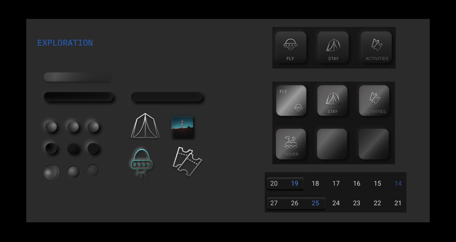
Additionally, I incorporated chrome treatments on some assets to ensure they stand out without overwhelming the other elements on the screen.
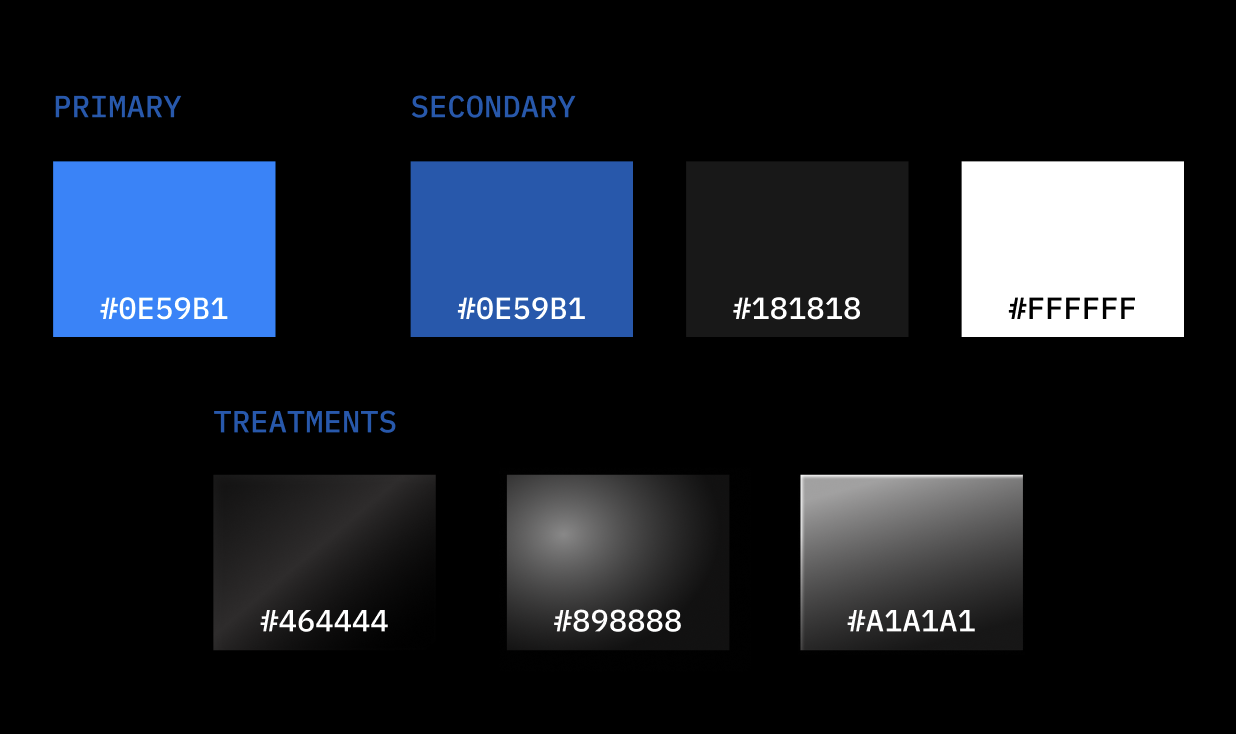
> COLORS

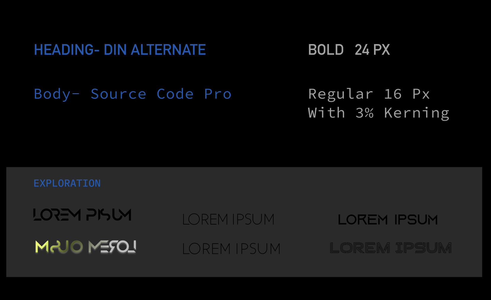
> TYPOGRAPHY
Originally, I planned to use display fonts that are typically challenging for humans to read. However, as I progressed in my design, I realized the importance of balancing the visual elements on the screen with fonts that are simple yet effective. It became crucial to select a font that not only looked clean when aligned to the right but was also easy to read.
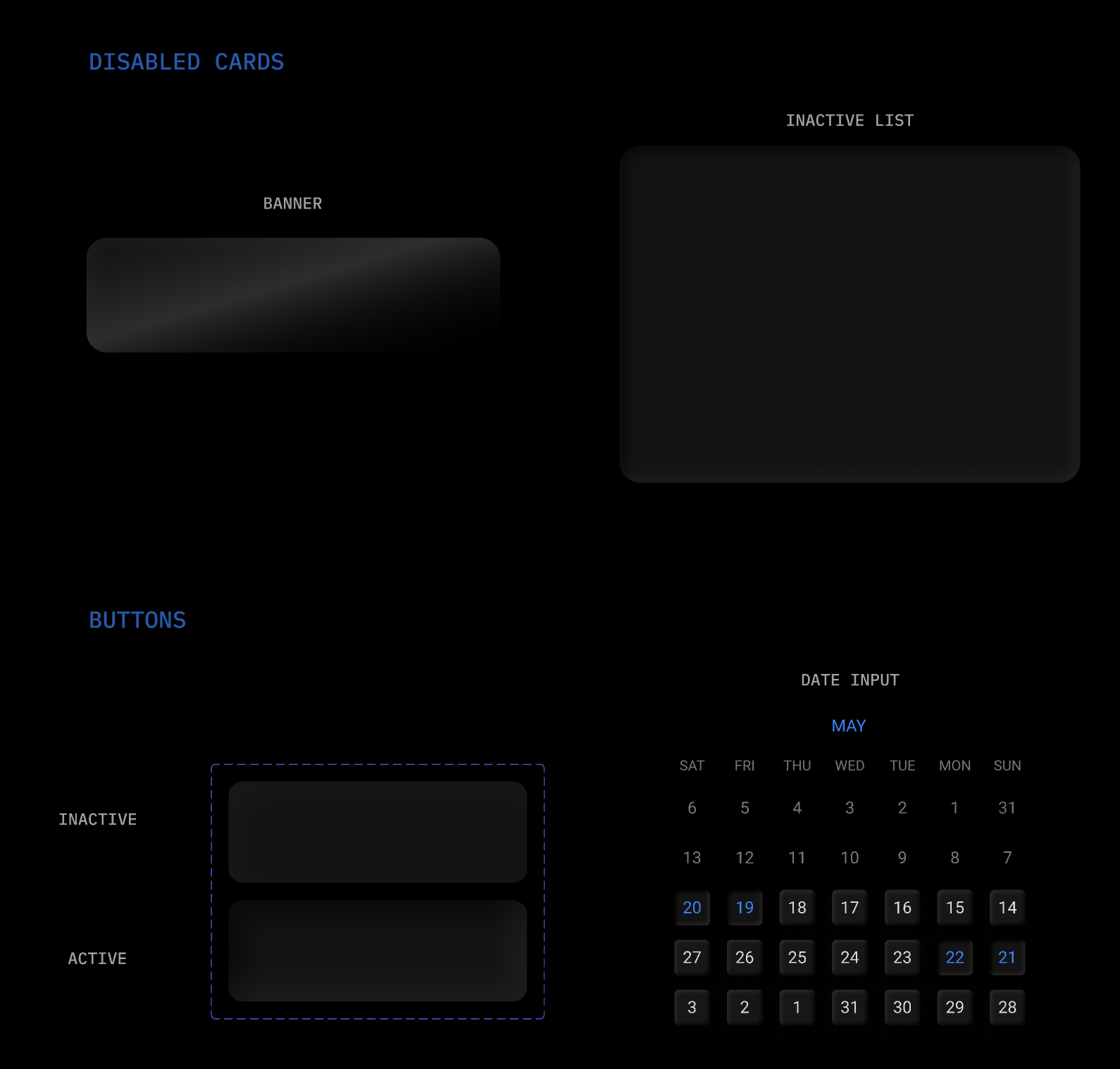
ASSETS
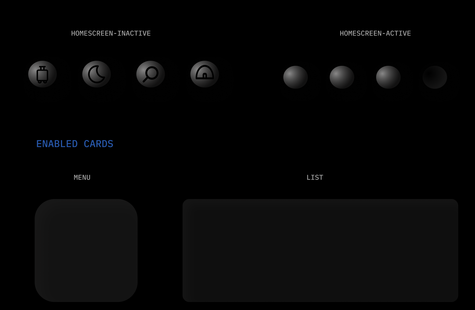
NAVIGATION
I designed the buttons to resemble bubbles that indent when pressed, giving them a subtle and interactive appearance. These buttons are crafted to blend seamlessly into the screen rather than immediately catching the eye. They are finished in dark silver chrome to complement, rather than overpower, the primary blue color of the interface.
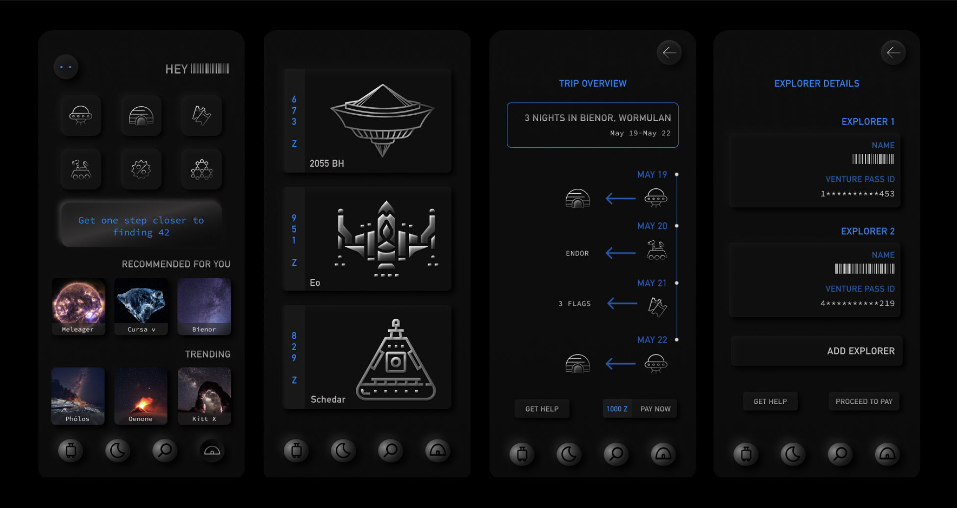
PROTOTYPE
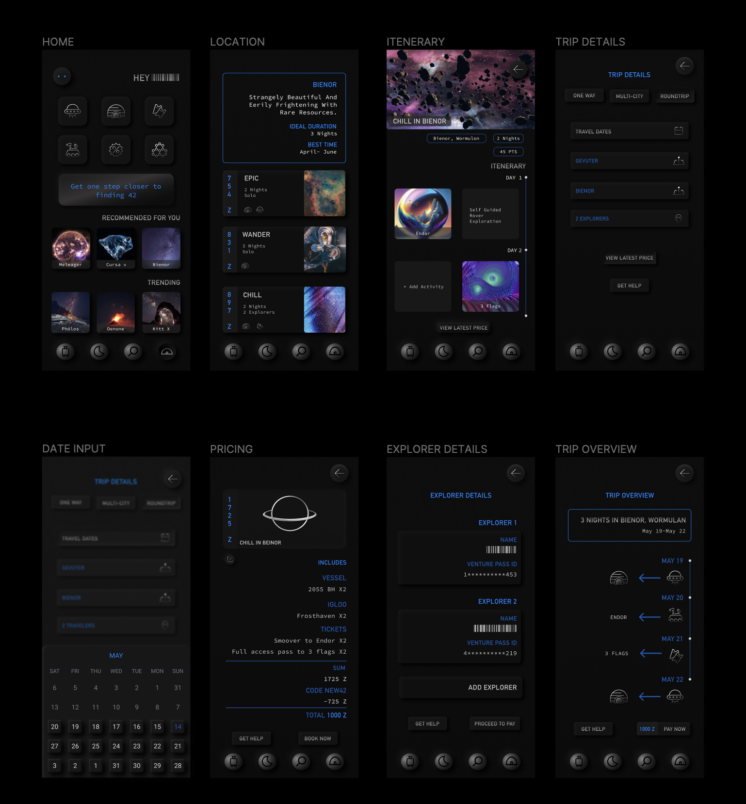
Prototype of the booking user flow
HIGH FIDELITY SCREENS

REFLECTION
I had a lot of fun with this!
As challenging as this project was, it helped me remain empathetic and think about the purpose of every element I was adding to the screen. Interestingly, I noticed that my designs often inadvertently leaned towards human tendencies, even when I was consciously trying to avoid them.
I recognized that there was a lot I could do differently if I were to do it again and so I did.
Check out V2 here.