Since the 2022 season, Formula 1 has been introducing interesting visual elements like bold accent colors and layouts in their marketing material. The website on the other hand, feel flat so I decided to redesign some of the key pages for the 2023 season to capture the sport’s grandeur and dynamism.
Goals
- Dynamic Design: Incorporate visual elements that signify movement, rush, and extravagance to reflect the speed and excitement of Formula 1 racing.
- Enhance Brand Perception: Capitalize on the official content from other mediums for an immersive fan experience elevating the overall perception of the Formula 1 brand.
Interface Analysis
I surveyed 15 individuals, both familiar and unfamiliar with the sport, and most found the current website unclear in its purpose and lacking a distinct point of view.
The amount of information on each page is overwhelming and cluttered.
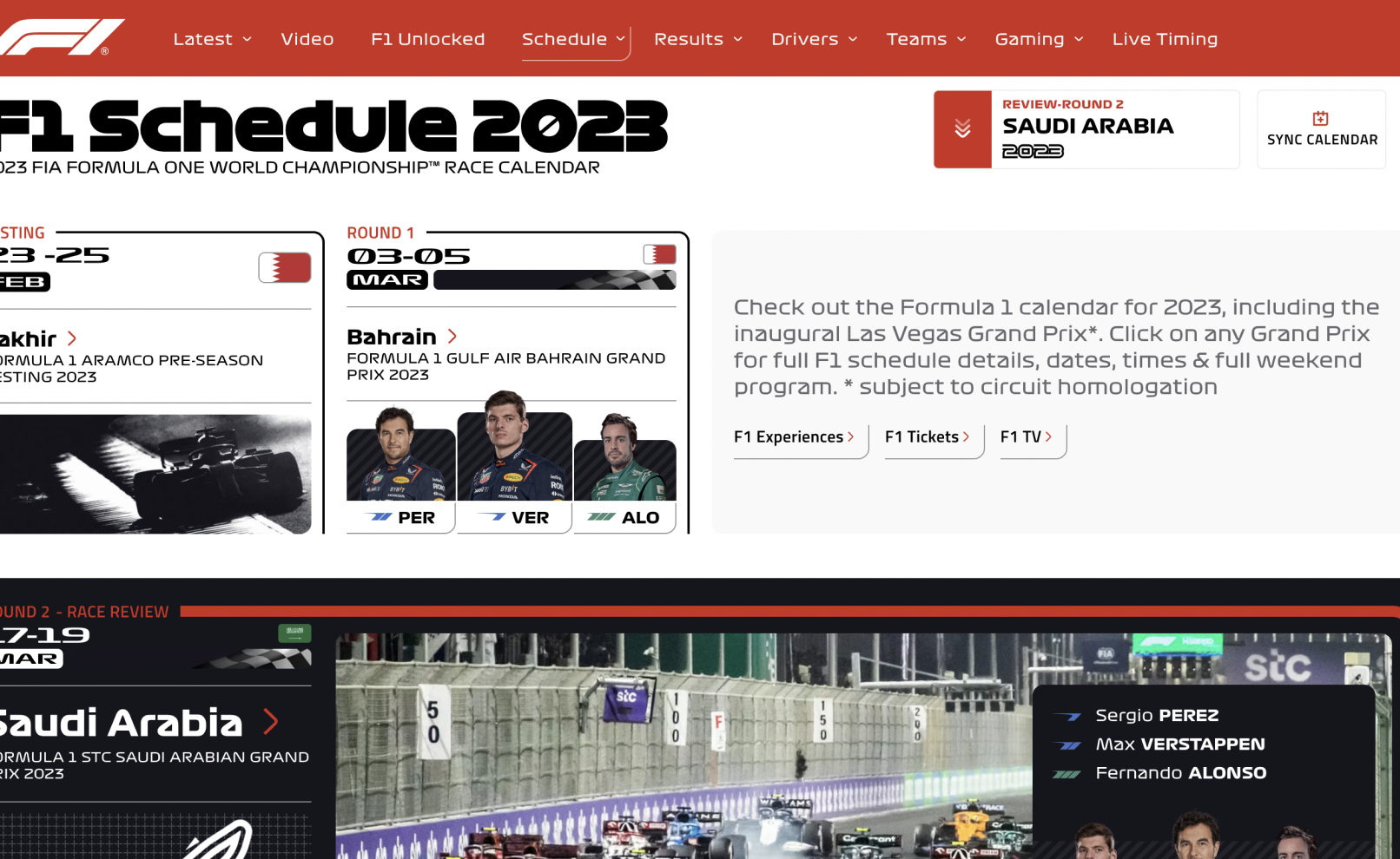
The elements are flat and don’t reflect the dynamism of Formula 1.
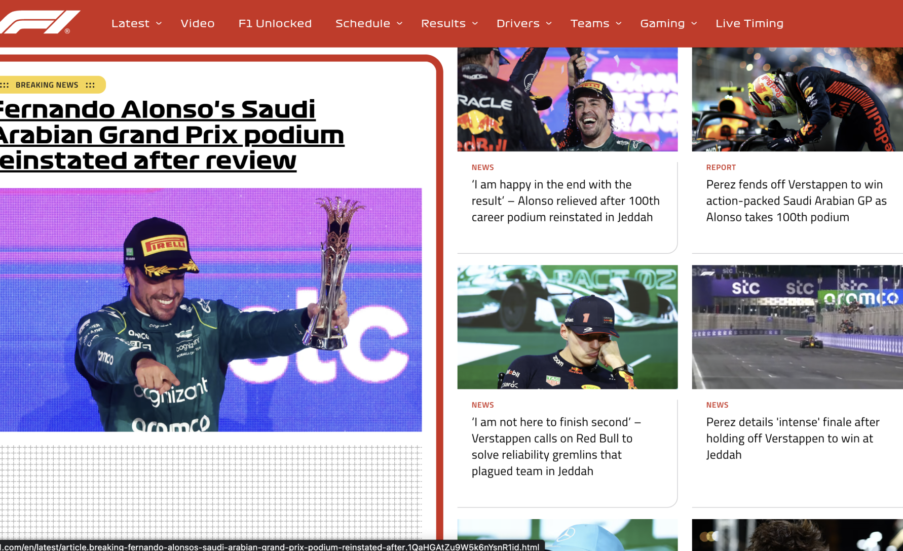
The flow is disrupted multiple times because certain elements look out of place.
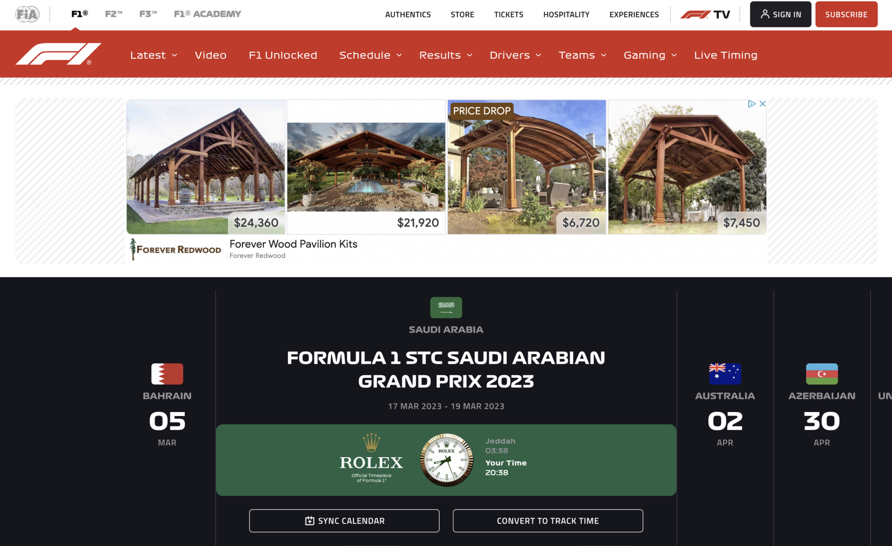
Objective
- Reduce visual overload.
- Make each element on the page look and feel purposeful.
- Make each page cohesive and maintain consistency across pages.
Challenges
- Crafting a minimalist design that retains the vibrant essence of a sports website.
- Harmonizing new design elements with established branding.
Visual Design
Colors
I wanted to stay true to the brand so I stuck to the iconic pure red while also introducing an accent color to reflect recent seasonal themes.
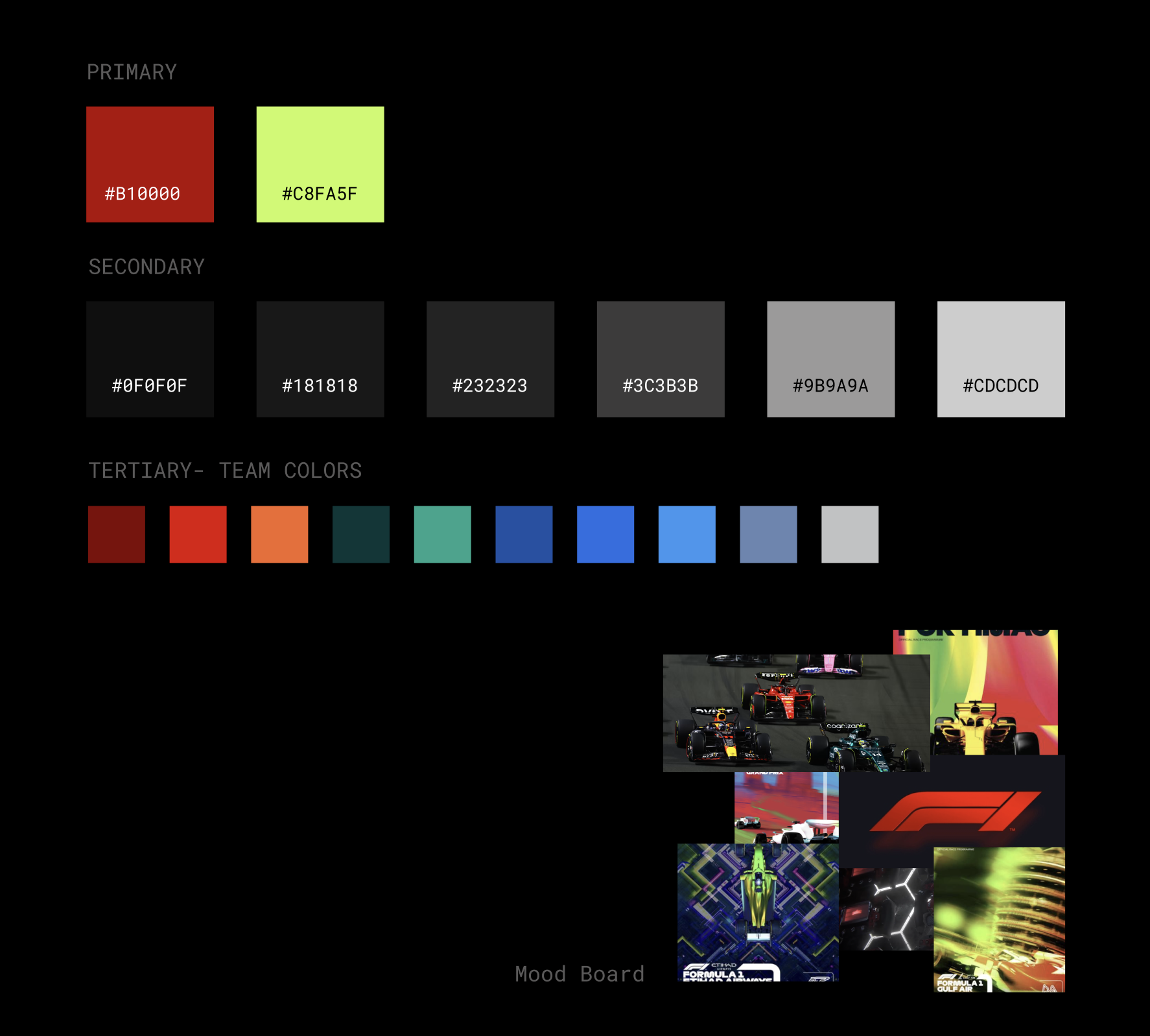
Color palette
Typography
I’ve used two clean sans serif monospaced fonts to balance the visual load because the other elements on the page are bold and loud.
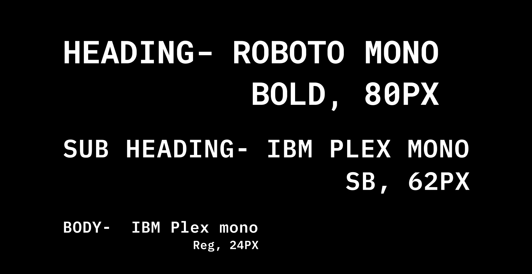
Type and font selection
Assets
Banner
I've used existing F1 content like title tracks, track promos, high resolution imagery.

Divider
Protruding lines with shadows to show movement.

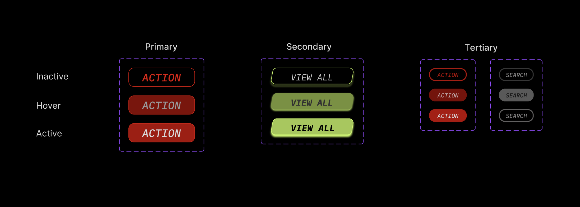
Buttons
Distinguishable buttons that are minimal yet powerful.
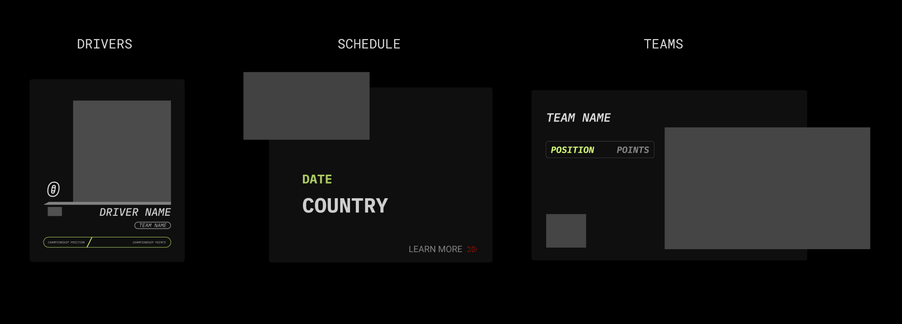
Cards
I’ve used cards extensively because there are repetitive elements on all pages to keep the layout simple and display only relevant information.
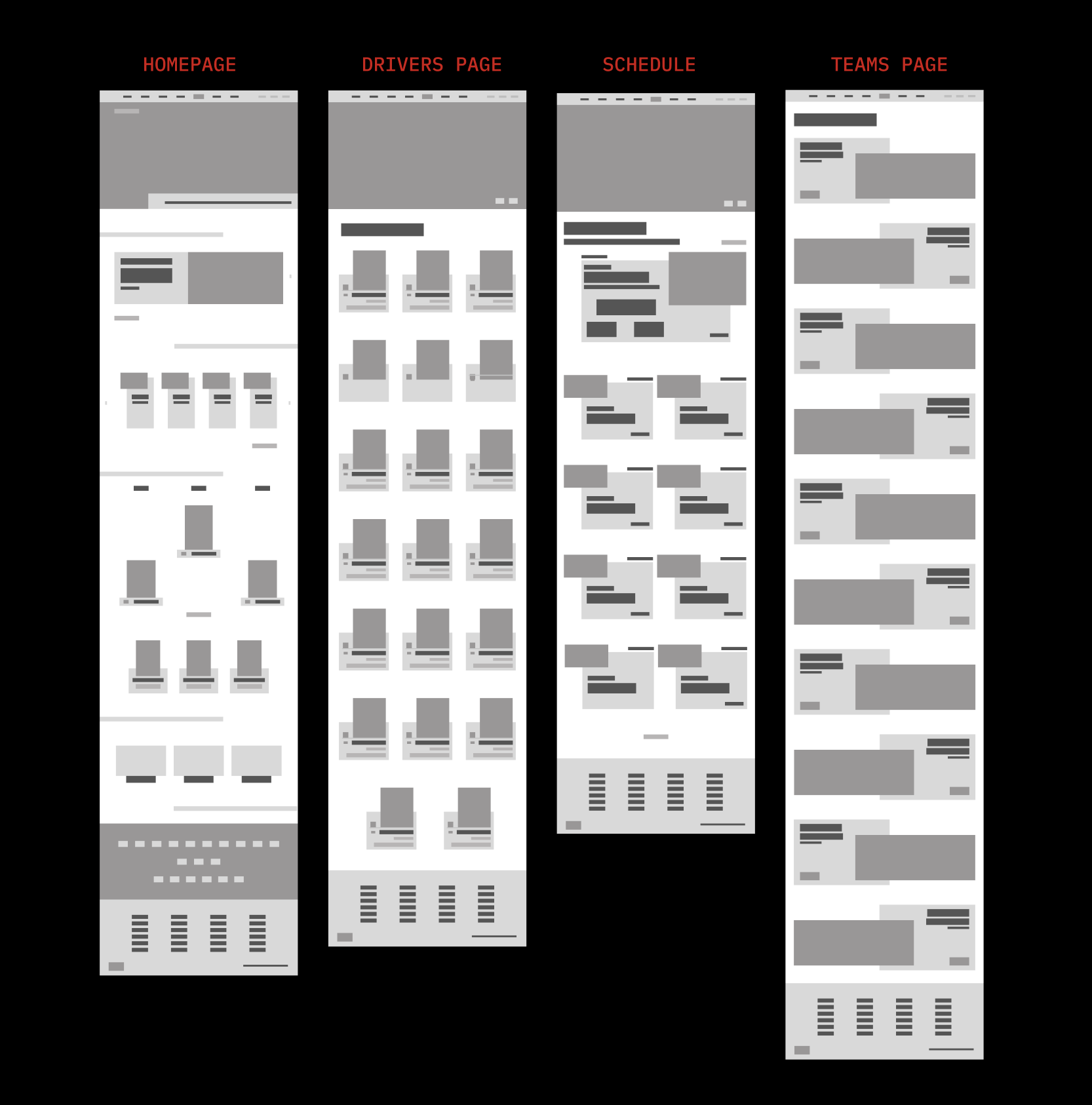
Layout
The existing webdesign lacks continuity so I chose columnar grids for all pages and used protruding assets to make it feel dynamic yet cohesive.
.gif)
.gif)


.png)


